Prato
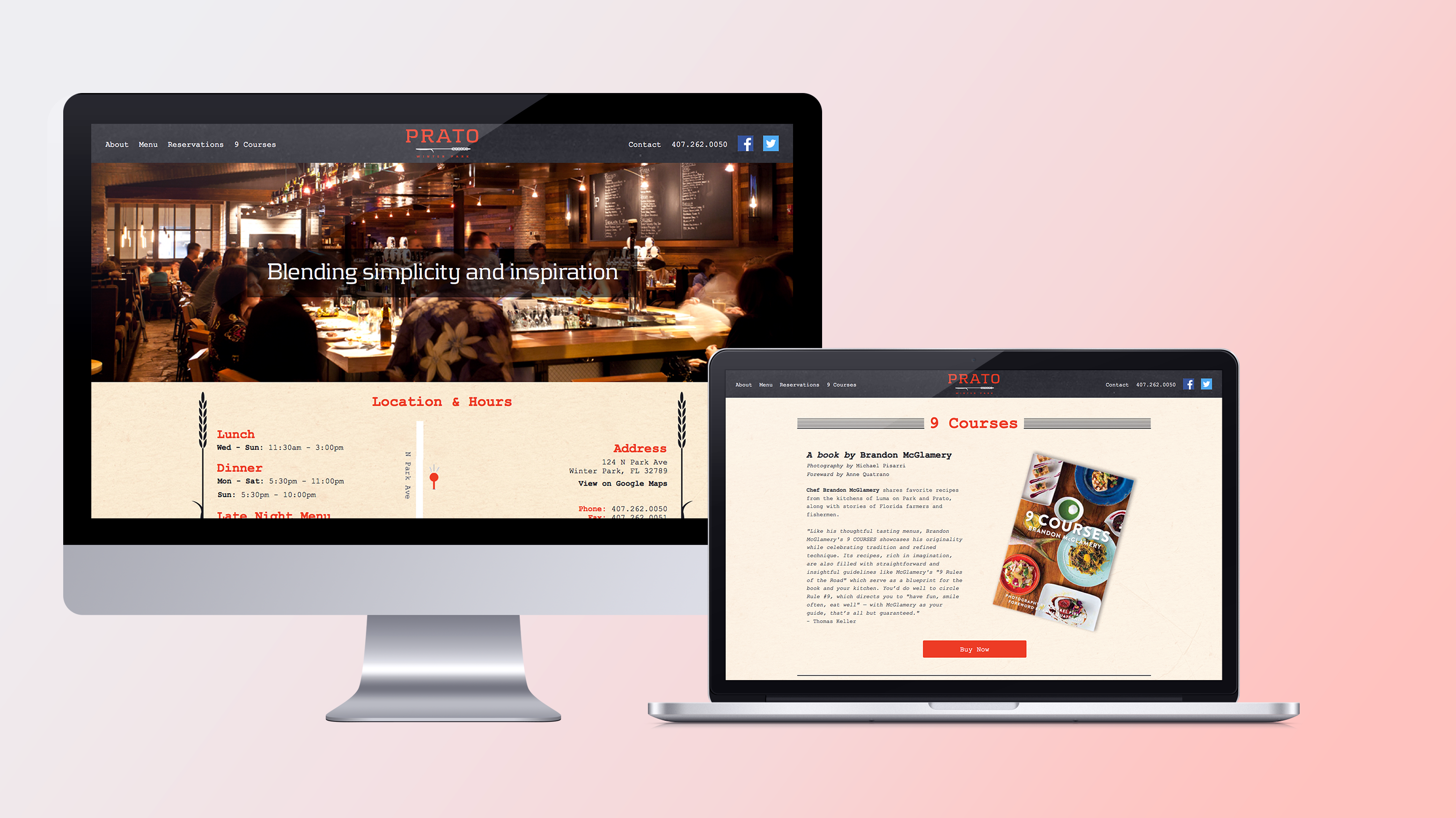
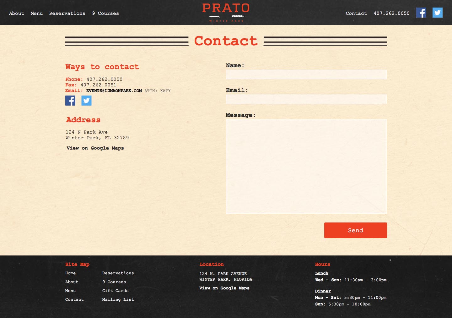
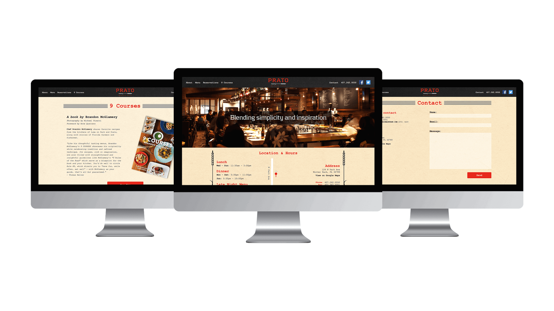
Why: There is not a real rhyme or reason for this project. I was on spring break and boredom got the best of me, so I found a website and reimagined it.
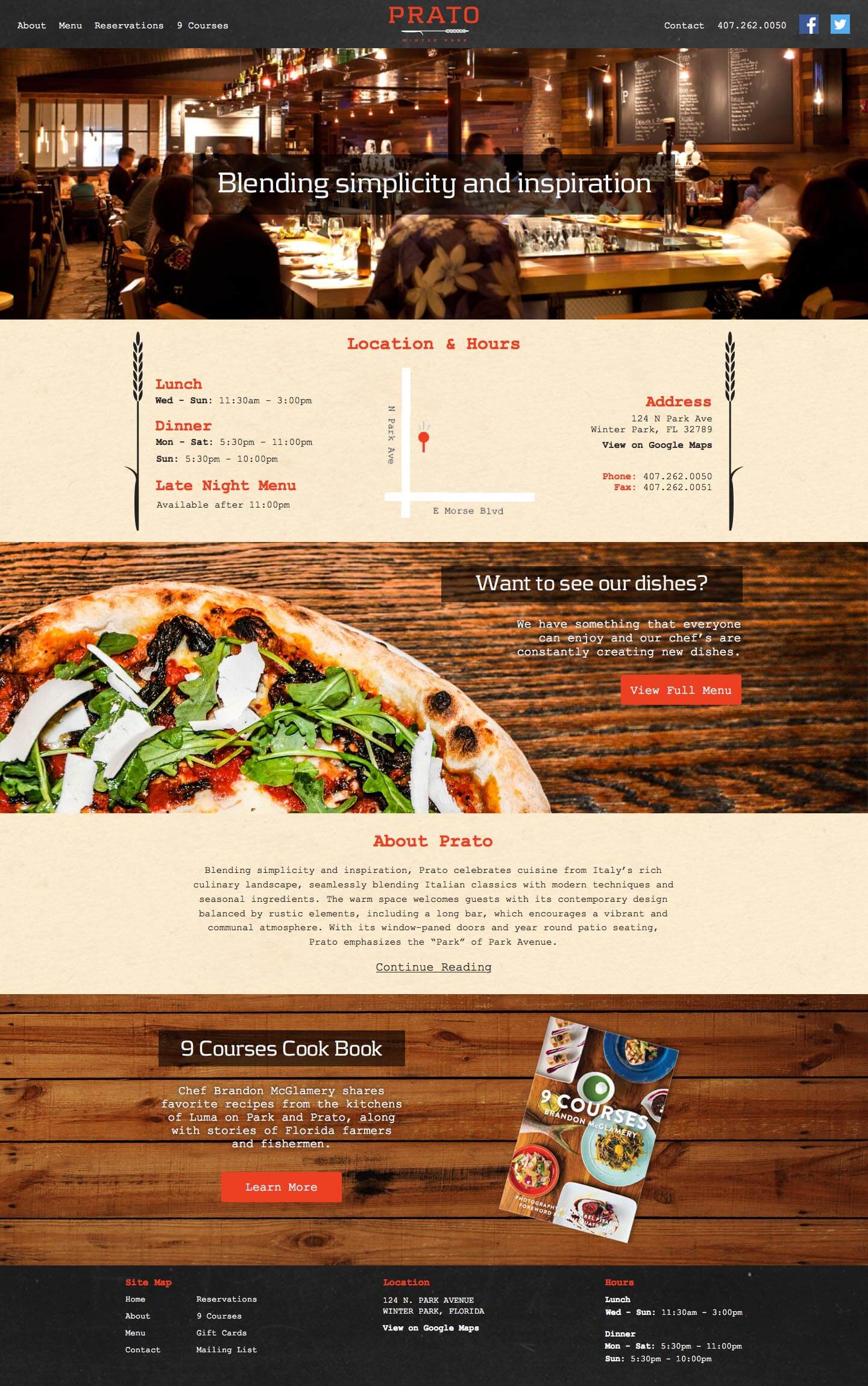
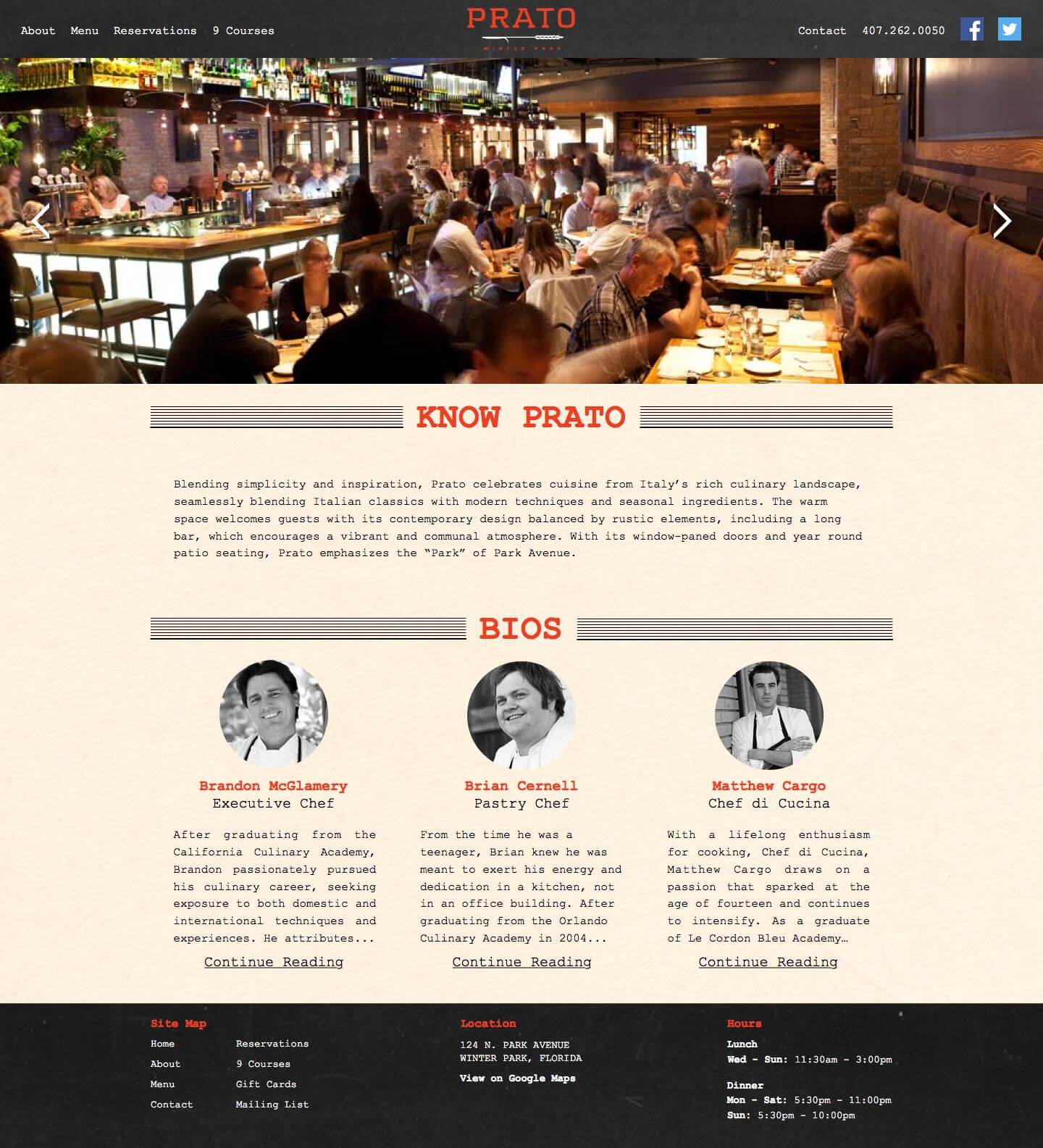
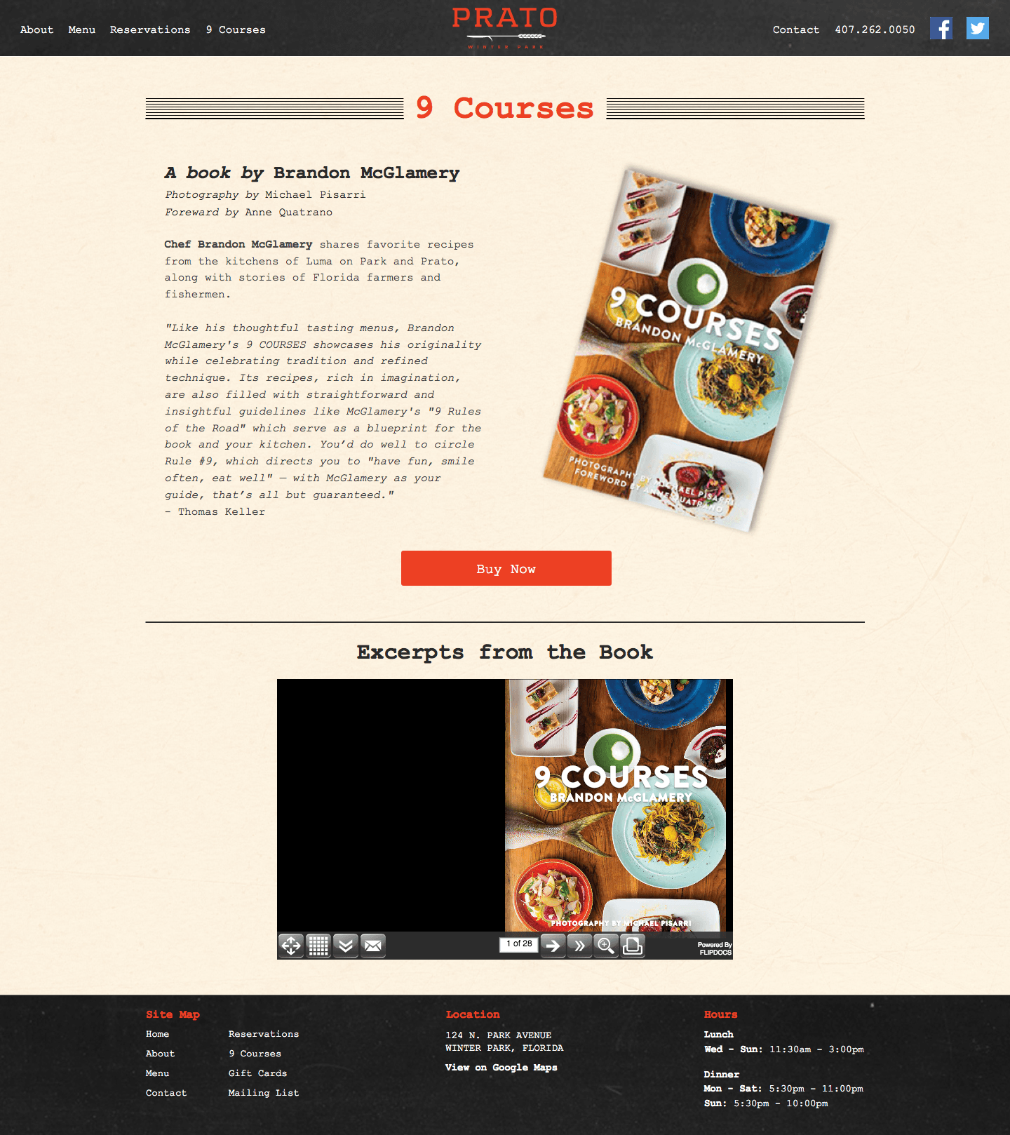
Goals: Maintain current branding styles, have anything every user could need within a few seconds of the initial loading of the website.
Results: I achieved maintaining the current branding styles by visiting the restaurant and taking note of the colors, textures, typography, experience and atmosphere. The second goal of providing the user with almost everything they would need on the initial load was achieved by evaluating what most users visit a restaurants website for: Viewing the menu, contacting the restaurant, finding the location or checking the business hours. All of that information can be found at the top of the home page within a matter of seconds.
